Pick Your Colour. Grow Your Brand.
Colours can evoke different emotions, associations, and responses that affect how your brand is perceived.
Put simply, colour can make or break a brand. In fact, research has shown that colour can increase brand recognition by up to 80%.
Since day one, we at justcoach knew that personal branding was important for you to help connect with, and coach your clients, while also building your brand.
You and your business deserve recognition…that’s why we made it our mission to roll out something special…we’ve been planning this since day one…
Introducing Branding for justcoach
All the power of the world's no.1 fastest growing coaching app, now with your brand colours. Maintain a professional appearance with your coaching brand colours, present across all aspects of the platform.
Unlike other apps, justcoach branding is available on all plans…no upgrade…no extra fee…simple integration at no extra cost, for a powerful brand experience.
How to Apply Your Brand Colours
It's easy to go overboard…over complicate…over design. At justcoach, we approach all our updates with dramatic simplicity.
Step 1: Find Branding
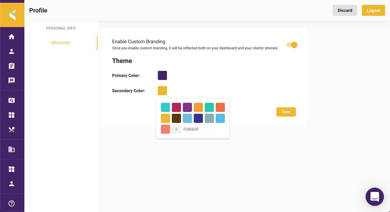
In your new web app dashboard > profile, you now have a side-bar menu with options for 'Personal Info' and 'Branding' - Click 'Branding'.
Step 2: Enable Branding
Under the tab Branding, you can enable custom colours with an easy toggle. This will apply your brand colours to both the web app and native app.

Step 3: Apply Your Colours
You can create your custom theme using a primary and secondary colour scheme. You’ll need the HEX code for your colours. The HEX code starts with a hashtag sign (#) and is followed by six hex values or three hex value pairs (for example, #516BF0).
Once you’ve chosen your colours, tap ‘save’ to apply your brand theme across your coaching app.
How to Choose the Right Colours
Primary (main brand colour) should be eye-catching but not harsh. It will be liberally applied to your layout as your main identity i.e. heading bar and splash screen.
Secondary (accent colour) is used to bring attention to important design elements by contrasting with the Primary choice i.e. buttons and design elements.
When selecting the two colours, make sure they compliment each other. If your Secondary accent is too bright or clashes with your Primary colour, it can make your brand look haphazard and untrustworthy.
Making colour palettes is a difficult process, because while most people can tell when a combination of colours is pleasing, it's hard to explain exactly why. Making it difficult to create a theme that's both pleasing and fits with certain pre-requisites, like branding an app.
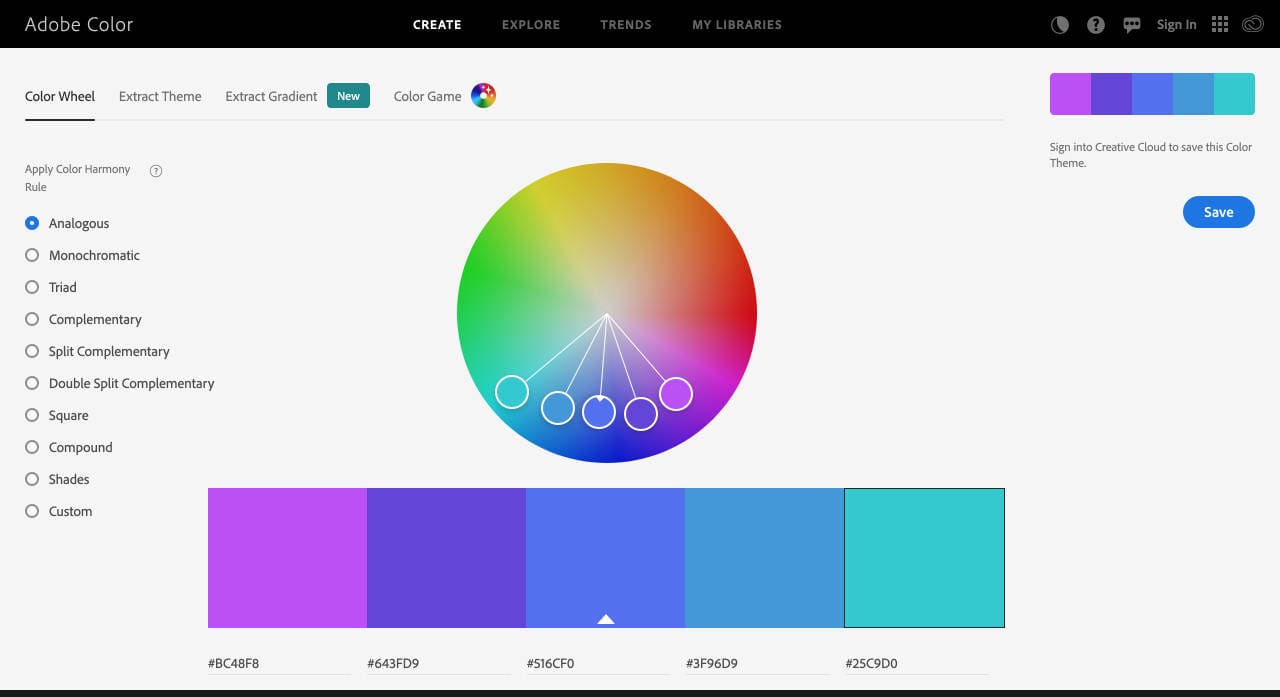
If you need a little inspiration, Adobe Color is a great tool for you to find the perfect match for your brand colours.

Let us Know What You Think!
What do you think of our branding update? We love hearing feedback on our features, and your suggestions for new improvements, so please drop a comment in our Facebook Group.

